- News
- entertainment
- events
- delhi
- Art lovers at Trishla Jain’s exhibition
Trending
This story is from January 22, 2012
Art lovers at Trishla Jain’s exhibition
Trishla Jain’s second solo show saw artists and art lovers of the capital discover the vibrancy and irreverence of ‘Tangerine Trees and Marmalade Skies’
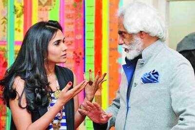
The word ‘art exhibition’ usually brings to mind a degree of formality and seriousness, but this one was an art exhibition with a difference. The sense of formality was immediately dispelled as one entered the home-like, white, open spaces where young artist Trishla Jain’s pop up exhibition “Tangerine Trees and Marmalade Skies” was on display.
The vibrant, pop colours brought the place alive, and guests repeatedly used the words ‘young’ and ‘happy’ for the work.
Trishla greeted everyone at the door with a warm namaste, and took them around. Of particular interest to the guests was the installation “Balderdash”, with a chessboard placed on it, where more than one visitor lingered, some even for a game! The work was in bright, pop colours, with the text on it reflecting Trishla’s musings, moods and literary influences.
While everyone was unanimous in the opinion that it was among the most ‘alive’ collections of art they’d seen, their opinions seemed divided on some other points – while some said that her work showed maturity, the younger crowd said that the work was ‘fun’. Stylist Pernia Qureshi said, “The work is very young – very girly, in fact – and I think it will appeal to young women.” Sunil Bharti Mittal’s son Shravin commented, “I love what’s written on the paintings. The work is very trendy, the kind of art that would appeal to our generation, even to those who don’t ‘get’ art.”
Chandna Arora and Kashika Saxena
The vibrant, pop colours brought the place alive, and guests repeatedly used the words ‘young’ and ‘happy’ for the work.
Trishla greeted everyone at the door with a warm namaste, and took them around. Of particular interest to the guests was the installation “Balderdash”, with a chessboard placed on it, where more than one visitor lingered, some even for a game! The work was in bright, pop colours, with the text on it reflecting Trishla’s musings, moods and literary influences.
While everyone was unanimous in the opinion that it was among the most ‘alive’ collections of art they’d seen, their opinions seemed divided on some other points – while some said that her work showed maturity, the younger crowd said that the work was ‘fun’. Stylist Pernia Qureshi said, “The work is very young – very girly, in fact – and I think it will appeal to young women.” Sunil Bharti Mittal’s son Shravin commented, “I love what’s written on the paintings. The work is very trendy, the kind of art that would appeal to our generation, even to those who don’t ‘get’ art.”
From among the older crowd, the assessment was a little different. Designer and artist Gunjan Arora, who’d seen Trishla’s first show, “That Freshness”, said, “I’m very happy to see that she’s moved away from just brush strokes to the use of words, which is very interesting.” Animal rights activist Ambika Shukla commented, “I find the work very original, very happening, and actually very Indian. It’s this kind of combination – the sort reflected in text like, ‘Prada meets pranayam’ – that I’m finding interesting.” And artist Niladri Paul took an artist’s view of the work when he said, “My eye is held by the colours – I can’t concentrate on the text. Behind the words is a perfect balance of colour and texture. I find that amazing, because it’s difficult to play with light and dark colours together and bring them into a kind of harmony.”
Chandna Arora and Kashika Saxena
End of Article
FOLLOW US ON SOCIAL MEDIA








Photostories
entertainment videos
Featured In Movies

Popular Categories
Entertainment NewsBollywood NewsTollywood NewsKollywood NewsMollywood NewsMovie ReviewsLatest Hindi MoviesLatest Tamil MoviesMX PlayerParenting TipsHome RemediesWeight LossBeauty TipsParenting TipsHindi VideosHindi Video SongsBhojpuri Music VideosLatest Telugu MoviesBhojpuri Music VideoHindi TV News
Trending in Entertainment
Latest MoviesBollywood MoviesHollywood MoviesTamil Movies 2024Telugu Movies 2024Malayalam Movies 2024Kannada Movies 2024Marathi Movies 2024Bengali Movies 2024Top Rated Movies 2024Best Hindi MoviesBest English MoviesBest Telugu MoviesBest Tamil MoviesBest Malayalam MoviesBest Kannada MoviesBest Bengali MoviesUpcoming Hindi MoviesBest Movies Of All TimeBest Hindi Movies of All Time
Trending in Etimes
PM Modi’s birthday through the years: From slicing 73-kg laddoo cake to Cheetah Project and Vishwakarma YojanaHoroscope TodayNumerology Predictions TodayElla EmhoffDonald Trump AssassinationKaren DunnJose LopezKristina JoksimovicJoe WilsonTrump Eating The Dogs SongGermany NewsKamala HarrisPrince HarryBelly Fat LossDiabetes RiskFull Moon in September 2024Relationship TipsSean DiddyMiley CyrusDave Bautista
Trending in TV
Trending in Lifestyle
Trending in Regional
Movie Reviews
Berlin ReviewThe Buckingham Murders ReviewSpeak No Evil ReviewVisfot ReviewThalapathy Is The G.O.A.T ReviewRebel Ridge ReviewDetective Conan vs. Kid the Phantom Thief ReviewBeetlejuice Beetlejuice ReviewPad Gaye Pange ReviewA Wedding Story ReviewThe Diary Of West Bengal ReviewTikdam ReviewKinds Of Kindness ReviewAfraid Review
Upcoming Hindi Movies
Upcoming Regional Movies
Latest News
Pankaj Kapur is proud of son Shahid Kapoor’s film choices, calls him ‘the finest actor in the country’Mukhtar Ansari died of heart attack, not poisoning: UP's Banda district magistrate's report4 types of tea to improve gut health and ease digestive issuesMemeFi daily codes for 17 September 2024: Boost your earnings with daily codes and know how to maximizeKhatron Ke Khiladi 14: Shalin Bhanot hosts a fun party for his co-contestants Krishna Shroff, Abhishek Kumar, KaranVeer Mehra and othersDecoding how log analytics systems are enabling brands to derive maximum value from dataSebi U-turn: Pulls note blaming 'external elements' for staff stirAnother Mpox suspected case in India: Man showing symptoms admitted to hospitalTaurus, Daily Horoscope Today, September 17, 2024: Anxiety and stress diminishLiza Colon becomes 1st Latina to win Best Supporting Emmy AwardSelena Gomez recreates practiced applause she learnt from TV show Friends after losing at Emmys 2024Former WWE superstar is no longer listed on their internal rostersBeyond Paychecks: Job satisfaction, work-life balance more important than salary for Gen Z workforceThrowback: When Sunita Ahuja showered love on husband Govinda, 'A superb son, brother, and a very good father...'‘You is sleep or you can sleep’: Students prank Benglauru’s ‘pookie professor’ in viral videoHow ‘Oxford returnee’ Atishi became chief minister of DelhiWhy more couples aged 50 or older are getting divorcedThese are the most toxic fresh produce of 2024
Other Group Sites -
ETimes is an Entertainment, TV & Lifestyle industrys promotional website and carries advertorials and native advertising.